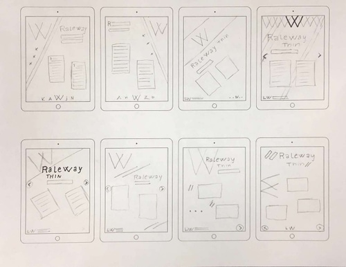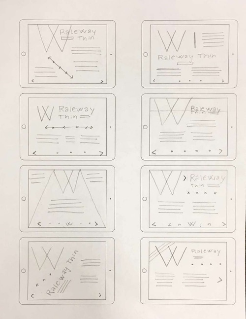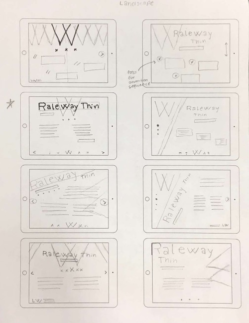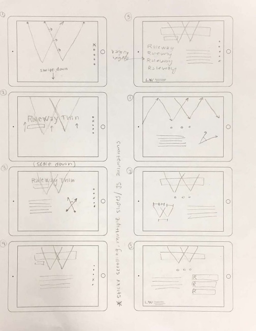

This letterform analysis serves as a prototype for an interactive A-to-Z typeface web app. It features the capital 'W' of Raleway Thin, designed by Matt McInerney and Impallari Type, and allows users to interactively view two letter analysis overlays.
All assets, icons, and overlays were designed in Illustrator and implemented into a semi-responsive single-page web app with HTML, CSS, and JS. The design features a neutral palette complementary geometric overlays.


Users can click through two analysis overlays. The first assesses the angular geometry while the second compares size relationships.

Users can navigate from letter to letter with a prototyped vertical scrollbar. Since the pages are designed as web-app ready, all links are JS instead of HTML, allowing for smooth page-to-page navigation.


